

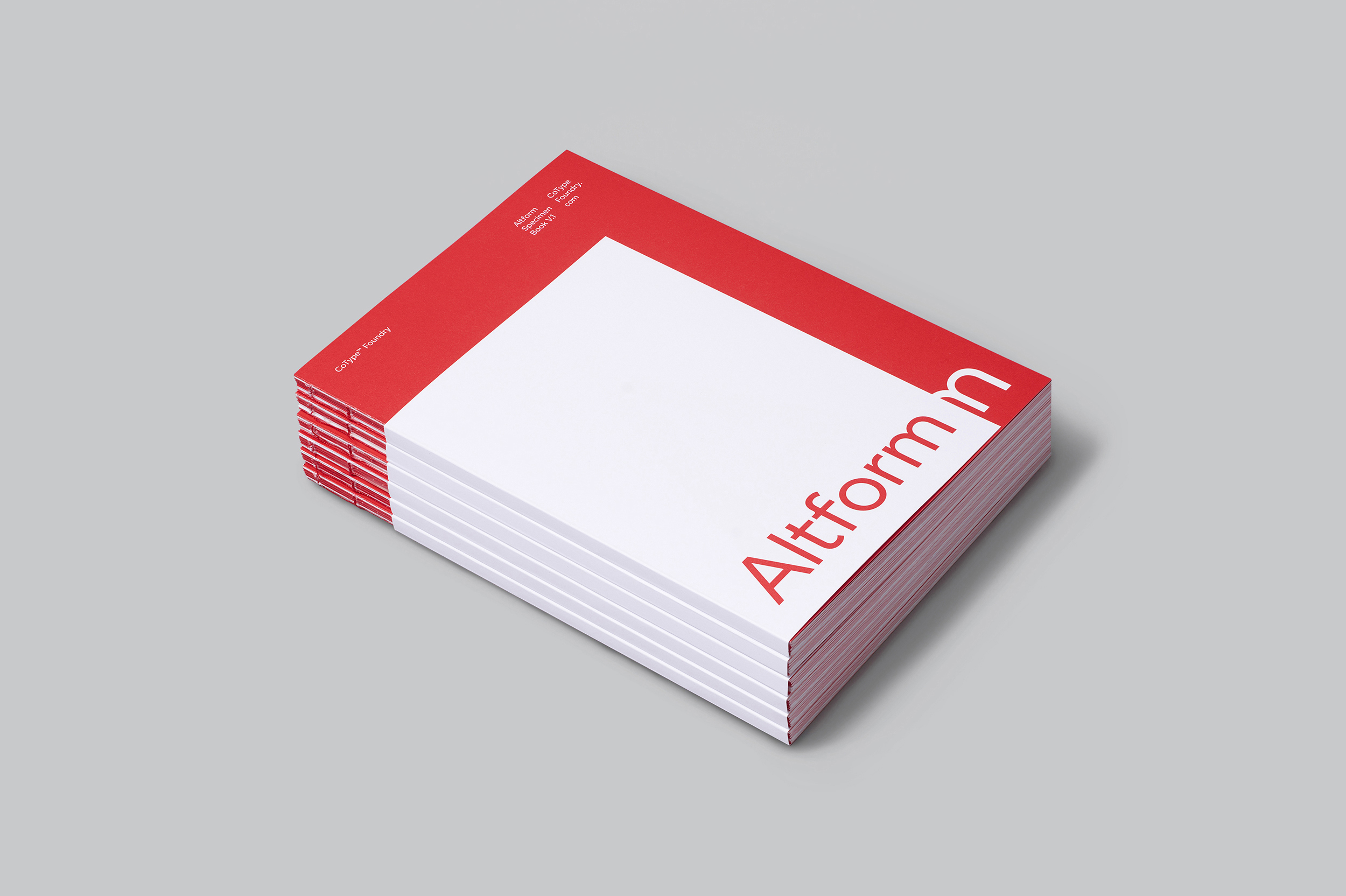
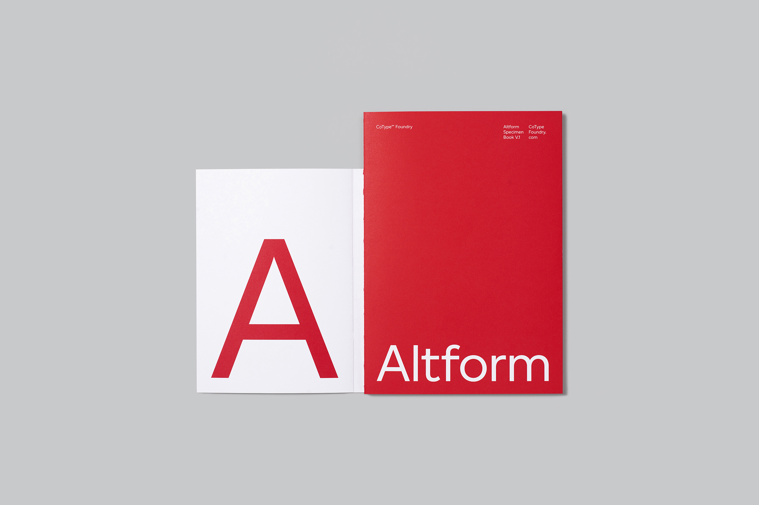
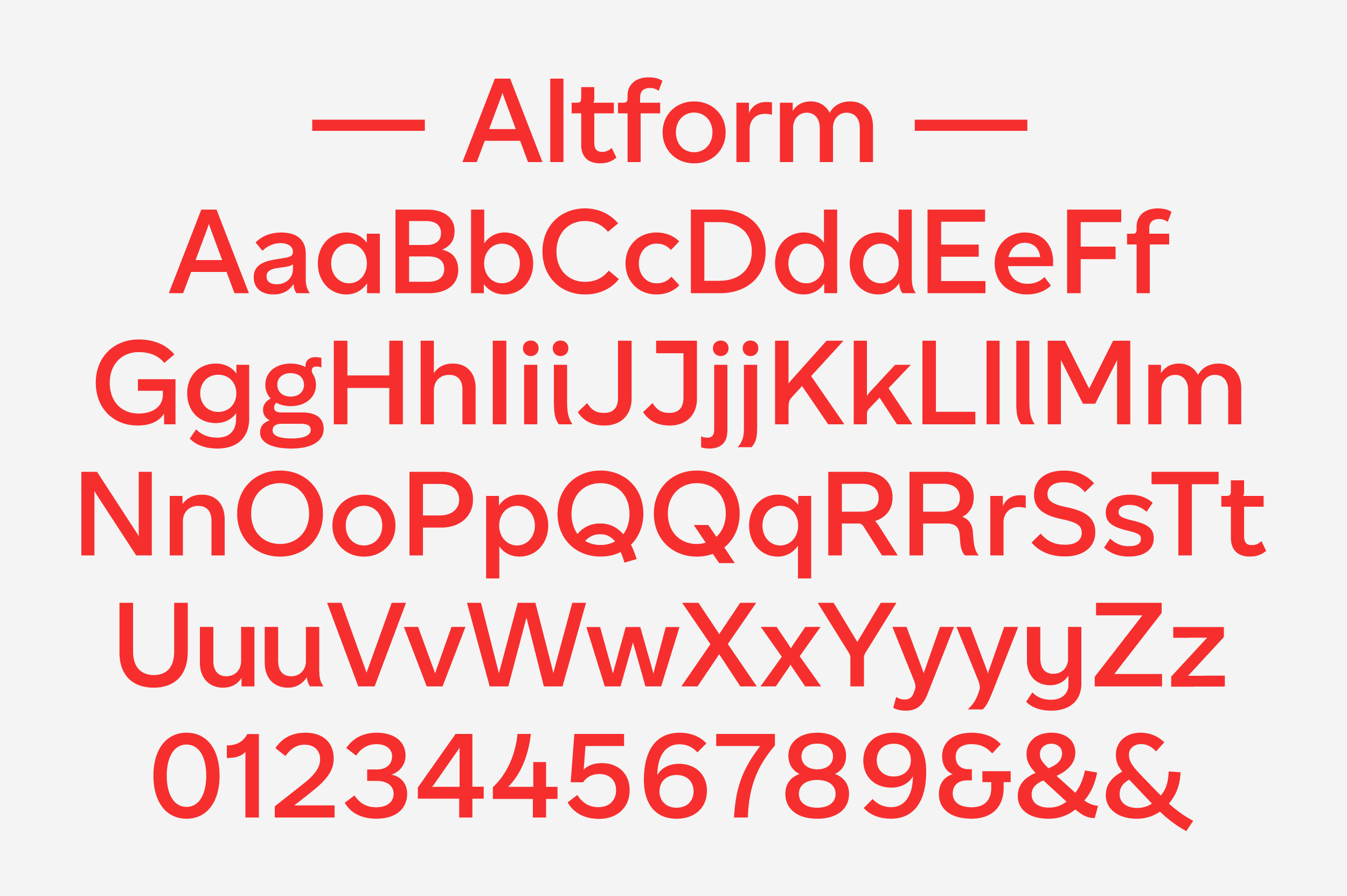
Altform from CoType Foundry is a solid and deceptively simple sans serif family with an alter-ego. Resulting from the marriage between a geometric sans and a grotesque, this typeface has a universally neutral appeal. Upon closer inspection, the reader will notice tiny exquisite curves in some characters like R, t, and k, which give Altform a subtle sophistication and recognisable character.
The Typeface
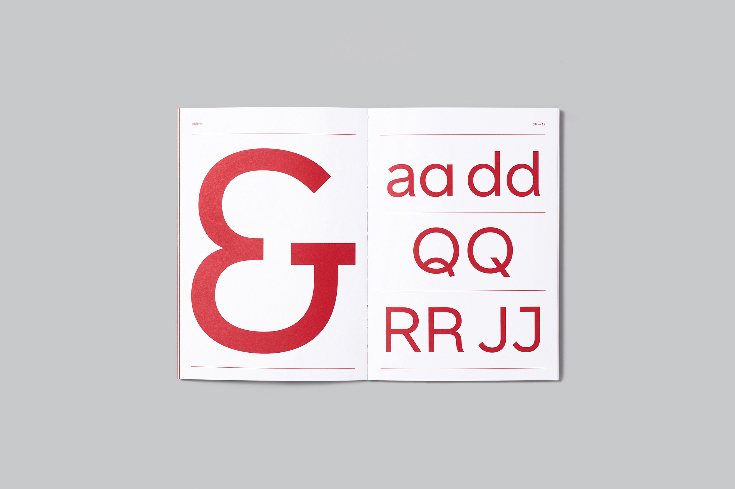
This apparently simple sans serif reveals an alternate personality in the OpenType features. With 11 stylistic sets to choose from, Altform allows you to enable alternate shapes, so that you can achieve a tailored look for every project. Perhaps the most interesting set of stylistic alternates are the “wind-blown” d, i, j, l, u, and y, which feature a slight curvature in the stems and infuse the typeface with a dynamic quality. Single-storey alternates of a and y can easily add a geometric simplicity to the typeface. Alternates of g, J, Q, R, and 4 as well as three different ampersands can each be switched on and off in the stylistic sets. To complete the kit, Altform packs a full set of weight-matched arrows, circled numerals, and geometric symbols, making this type family a perfect candidate for complex editorial and branding projects.
This apparently simple sans serif reveals an alternate personality in the OpenType features. With 11 stylistic sets to choose from, Altform allows you to enable alternate shapes, so that you can achieve a tailored look for every project. Perhaps the most interesting set of stylistic alternates are the “wind-blown” d, i, j, l, u, and y, which feature a slight curvature in the stems and infuse the typeface with a dynamic quality. Single-storey alternates of a and y can easily add a geometric simplicity to the typeface. Alternates of g, J, Q, R, and 4 as well as three different ampersands can each be switched on and off in the stylistic sets. To complete the kit, Altform packs a full set of weight-matched arrows, circled numerals, and geometric symbols, making this type family a perfect candidate for complex editorial and branding projects.
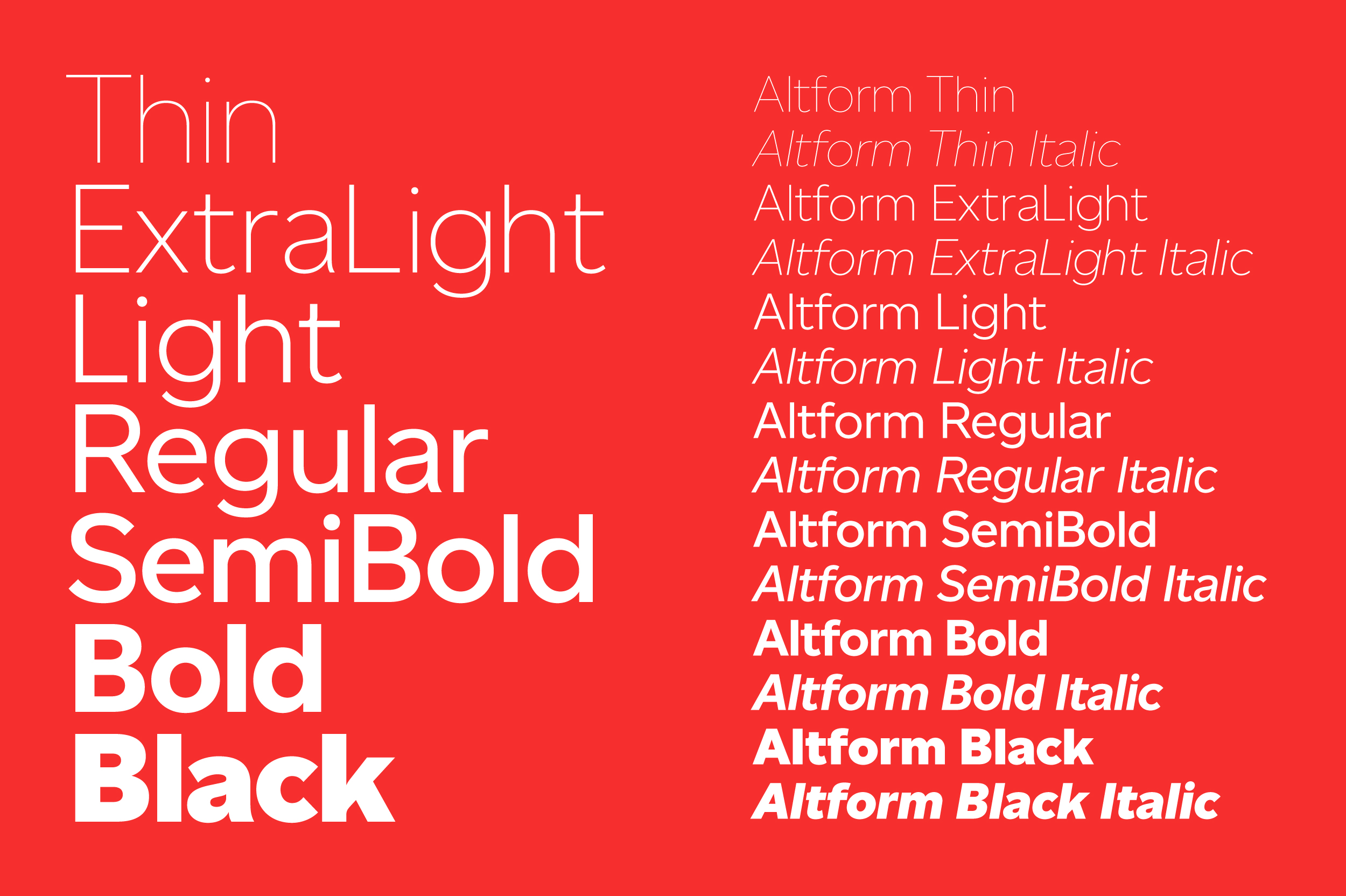
Altform is available in seven weights, each with italics, ranging from Thin to Black. The extensive language support allows type setting in most European languages written with the Latin script.
The goal in creating Altform was to offer a functional and sturdy sans serif family, which can adapt itself to multiple settings. The Thin and Black weights can be used to make a statement at large sizes, while the in-between weights feature great legibility in running text. With its many alternate shapes, Altform offers great value for designers since it can
be re-used time and time again.
For those demanding projects where none of the pre-defined weights quite cuts it, we are providing designers with a variable font version. In supported environments, users can select from literally hundreds of weight grades for more flexibility and versatility. Altform also features an italic variable axis, where a custom slant angle can be selected between 0 (upright) and 10 degrees (default italics).
Altform is a great substitute to over-used fonts such as Avenir, Proxima Nova or Helvetica. It is well balanced modern sans-serif typeface that is capable of being the core of visual identity system.