

When it comes to logo design there are certain guidelines you want to stick to. Those that apply to iconography in logos do work the typography in a logotype as well. There are four characteristic rules we follow. Making the logo simple, legible, optically balanced and appropriate.
01. Font Selection
Selecting the right typeface for your logo is key. Pick one that is not appropriate for the company and it can ruin the whole image of the brand. We generally use Serif to convey tradition or history. Sans-Serif for more neutral and modern logos. Or to just complement a logo mark.
Second step is choosing the best font. This is hard. Because everyone has different taste. It is not a clear-cut since it is very subjective. Try sticking to the classics unless the brand calls for something different and specific. Pay close attention to the letter shapes and how all of them fit together. You are working with predefined letter combinations. So choosing font that makes all the letters complement each other is a great pick.
Search on a site like MyFonts to get the biggest selection of fonts.
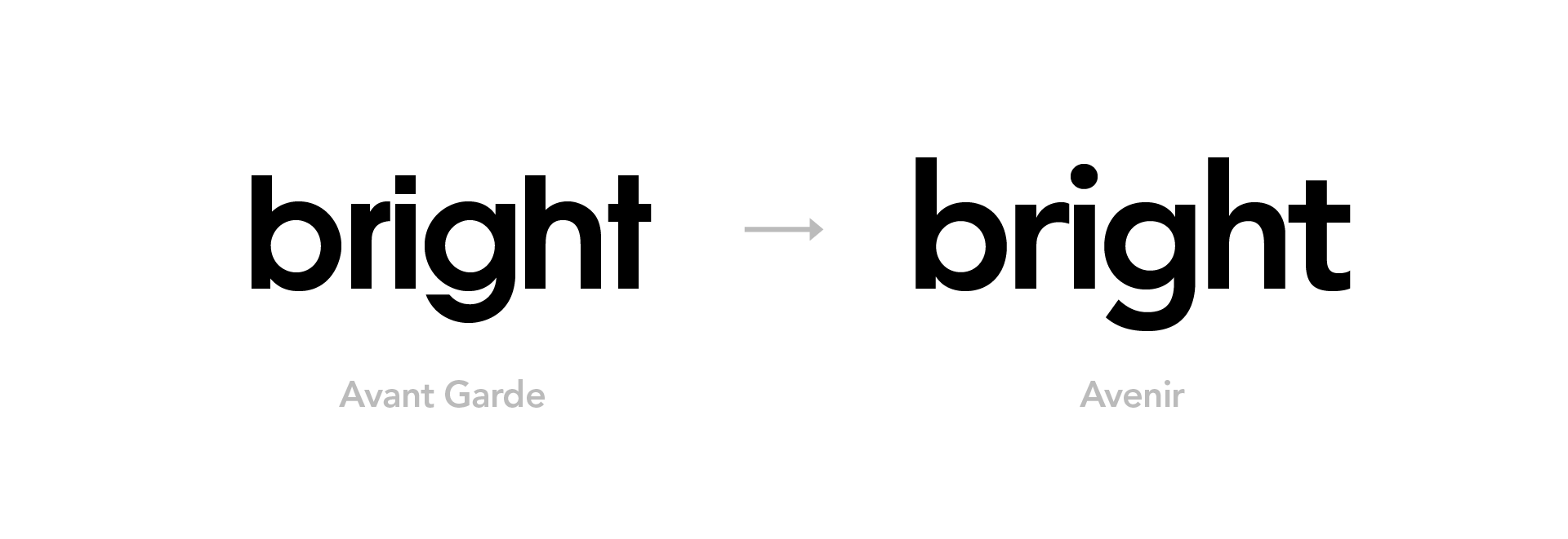
For the word ‘bright’ Avant Garde does not work well with those big counters in ‘b’ and ‘g’. Thats why Avenir is much better pick. Feels more balanced.
02. Letter Spacing
Take font straight out of the box and type a word. The spacing between the characters is set for small point sizes and paragraphs full of text. When we read the paragraph it is much easier for our eyes to smoothly read the whole paragraph with loose spacing. We will treat the logo like a display title. It is big and has very few letters in it. We tighten the letterspacing so that the logo becomes one coherent unit but is still readable.
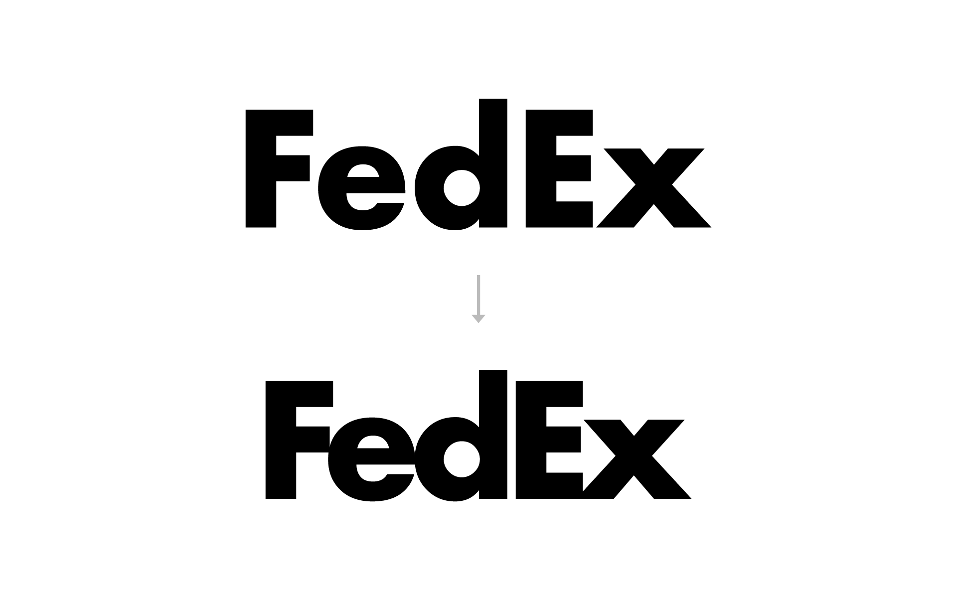
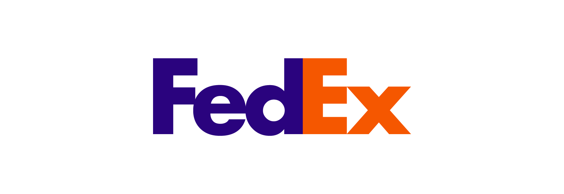
Take a look at FedEx logo. Futura Bold is used for this logo in particular. Typing the word FedEx with the default kerning is terrible and fall apart. Only when we tighten the spacing it gets more complete. The only exception to tight spacing is when the typeface is very lightweight. To the point where giving the letters more space to breathe is actually great idea. Example of this is AVON.
03. Modification of Letters
Every logo is different and uses different combination of letters. So we can’t pinpoint what to adjust exactly. We can say: We are trying to edit the letters so that they seem to be ment for each other.
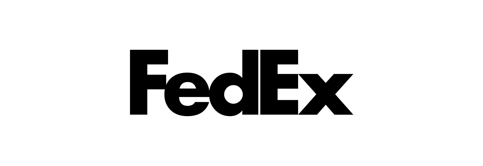
Take for example the FedEx logo. Cutting off any overhanging lines to make it look perfectly aligned. And scaling the lowercase letters to align with the second branch of ‘E’ and ‘F’. This way the lowercase letters are more established. And, of course, creating the famous arrow everyone talks about.
Force nothing. If it looks too gimmicky and forced, it probably is.
04. Color
The majority of the time black or dark grey is used. Simply to contrast with the logo mark which is colorful. But for times when you want to use color. You would use the brands’ primary color. Yahoo purple or Coca-Cola red. Always keep the contrast in mind. Don’t pick light yellow color just because it is primary.
05. Logo Lock-Up
What is it? It’s when you combine typography with mark. The goal of creating the perfect logo lock-up is to balance:
- The scale ratio of icon section and typography section.
- Space between those two elements.

Scale ratio. You have to eyeball it. Compare the mass of the icon to the text until both are optically in harmony.

Space between the elements can’t be too close to the text. So it doesn’t feel it invades the typography space. But can’t be too far away either. So it doesn’t feel it is being detatched.
Wrapping Up
These guidelines should give you an idea how to go about picking, editing and positioning your text in your logo lock-up. But you know what they say. Practice makes perfect. Observe some professionally made logos of multinational companies. Look for these points and how they are used. And try for your own.
Amazing information, Now I can avoid the mistakes I have been doing in the selection of fonts for my logo designs. Thank you It really helps me to solve my mistakes in the selection of font for my logo. Keep up the good work.
Hey Simon, glad the article helped! Good luck with your logos 🙂